
The rise of the metaverse has created an exciting moment for colour, with shades that morph phygitally between the physical and digital realms. Unexpected colour choices have come to the fore, made newly relevant by the moment in which we find ourselves today, where, more and more, life blends digital applications with real-life situations. Readily visible, colour clearly reflects the zeitgeist and signposts the way forward.
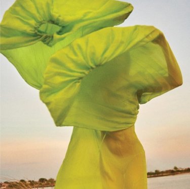
The saturated intensity of ‘dopamine brights’ – a recently coined term – puts a happy smile on the face of colour, while new colour names like ‘cyber lime’ and ‘digital lavender’ tint our world a brighter shade of pale.
‘Through our own ongoing research and that of our RX Global network, we’re able to map these shifts and translate them into macrotrends that are easy to understand and apply, so that interior designers, architects and homeowners can remain up to date”, says Decorex Africa’s Bielle Bellingham. RX Global is the world’s largest event organiser, while Decorex Africa, now in its 30th year, presents premier annual decor, design, and lifestyle exhibitions. Decorex Africa released its authoritative State of the Industry Report 2023 late last year, a capsule overview of major directions for the future that is free to download.
Decorex Africa recently presented an industry talk on the colour trends that visitors can expect to see in evidence at upcoming shows in Cape Town and Joburg. Highlighting colour choices for contemporary interior design to take us from 2023 into the future, Bellingham says, ‘On the whole, what we’re seeing is a mix of cautious optimism and escapism that people are craving post-pandemic, even in times of budget crunch.’
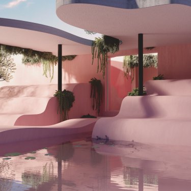
A trend demonstrating the power of newly initiated Gen Z consumers is the rise of soft, dusty shades of lavender and lilac – and Bellingham is not the only forecaster to hone in on the fluid purple-pink mix of Digital Lavender. Leading local paint brand Plascon has included it in recent seasonal paint palettes and WGSN, an international trend insights group, has spotted the shade everywhere, from Jil Sander’s fashion collections and Mercedes-Benz concept vehicles to digital artist Andrés Reisinger’s voluptuous and enigmatic virtual furniture.
Gemma Riberti, Head of Interiors at WGSN Lifestyle & Interiors, and WGSN’s colour strategist Clare Smith, both predict that the colour will dominate table-top and soft furnishings, in addition to walls. ‘It’s a sensorial shade that connects to holistic wellbeing and digital optimism,’ they tell us.
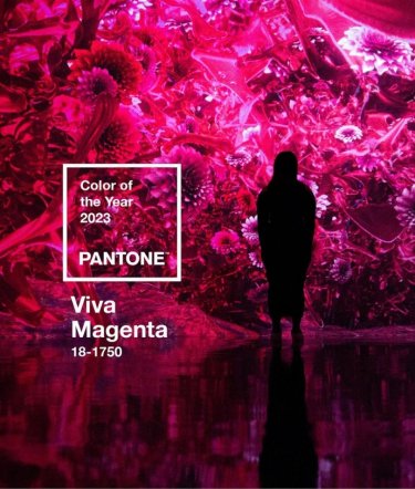
Digital lavender is a softer shade of purple than that identified by other trendsetters. Pantone, meanwhile, named Viva Magenta as its frontrunner for 2023 – a jubilant purply red that felt in line with the digital-first zeitgeist. For them, the choice aligned with ‘this idea of needing more energy, more vim and more vigour’.