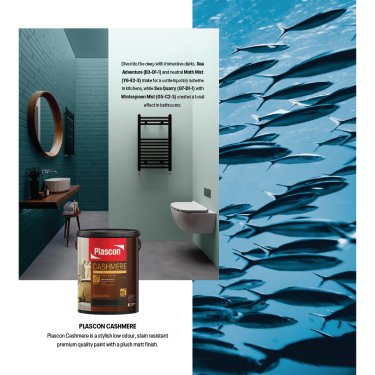
While many of us have been seeking refuge in green spaces like forests and parks, and incorporating leafy hues into our home, recent studies have found that blue spaces are associated with more positive measures of physical and mental wellbeing. Environmental psychologist Dr Matthew White, who is a member of BlueHealth, a programme researching the benefits of urban blue spaces, notes that ‘spending time in and around aquatic environments has consistently been shown to lead to significantly higher benefits, in inducing positive mood and reducing negative mood and stress’. In light of these findings, and our collective desire for calm, reassuring spaces,
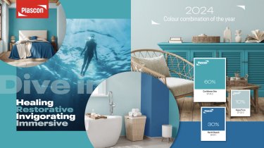
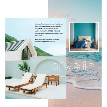
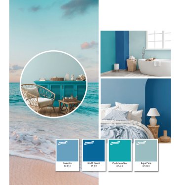
Plascon looked to the allure of water to transform our homes – and they didn’t need to look far: South Africa has a profound affinity with this life-giving source, thanks to our thousands of kilometres of coastline, many pristine lakes and abundance of waterfalls. Crystal-clear Caribbean Sea (G7-A1-2) is the colour representing the largest percentage in the design ratio. On its own, this colour evokes sun-lit shallow waters on a warm day, while its pairing with the other two – North Beach (B4-B1-1) at 30% and Aqua Pura (G7-C2-2) at 10% – captures the full spectrum of aquatic blues.
The vibrant warm turquoise of crystal-clear Caribbean Sea (G7-A1-2) with its green undertone is invigorating, bringing energy and a sense of renewal into any space. North Beach (B4-B1-1) is a bold and saturated azure representing the enveloping comfort of the deep without being too cool. And the gently shaded blue-green Aqua Pura (G7-C2-2) is the perfect highlight, a pale near-neutral reminiscent of rays of sun sparkling on water.
The Head of Decorative Marketing at Kansai Plascon, Suvasin Moodley, sees great decorative potential in this trio of colours: ‘Because Caribbean Sea, North Beach and Aqua Pura have been carefully selected by our team to complement each other, you can really play around with how much or little of each you’d like to add to your space,’ he says.
And, indeed, there are loads of ways to incorporate these stunning colours into your spaces. Aqua Pura (G7-C2-2) is an excellent choice for a more neutral base: add an accent wall to your lounge, use it to colour your kitchen cabinets or give your bathroom floor a makeover. The deep North Beach (B4-B1-1), meanwhile, can serve as an alternative to black or dark wood, working beautifully to transform wooden furniture or adding depth to your bedroom on a headboard. And the warm turquoise of Caribbean Sea (G7-A1-2) is perfect for adding decorative touches, not just through paint, but in the form of scatter cushions, couch throws, ceramic vases or lamp shades.
‘We wanted to make transforming your home into a blue space as simple as possible,’ notes Moodley. ‘The Colour Combination for 2024 captures the vast spectrum of blue in nature, so by simply incorporating the trio into your home, you unlock its powers.’